
Case Study 1: District Brand Systems & Federated Governance
How to Lead Brand Systems Across a Five-Campus College District
Context & Challenge
The Peralta Community College District serves the East Bay through four colleges and a central District Service Center, all packed into a 9-square mile 6-city service area. Each campus has its own culture, history, and personality, but students don’t stay put. This information fluctuates from year to year, but on average, about 45% of students take classes at more than one college in the same semester; many identify simply as a “Peralta student” rather than aligning with a single campus.
That movement between colleges became the core challenge. The problem wasn’t that each campus looked different. The problem was that nothing felt connected. Materials worked in isolation, but not together. As Chancellor Tammeil Gilkerson has said in her speeches, the district needed to “embrace the swirl.”
Role & Responsibility
As the sole classified graphic designer for the Peralta Community College District, I led the development and implementation of a district-wide brand and visual system spanning four colleges and the District Service Center. I was responsible for establishing visual governance, defining brand standards, and creating scalable tools that could be adopted across multiple institutions with differing needs. This included developing comprehensive brand guidelines, designing campus and district maps, Class schedules and other collateral, and clarifying how the district brand should function in relation to individual college identities.
I worked closely with district leadership, campus stakeholders, and internal communications teams to ensure alignment, accessibility, and long-term viability. This required navigating institutional priorities, balancing autonomy, consistency, and translating our complex organizational structure into clear visual systems.
In addition to design and strategy, I served as a steward of the brand over time, refining standards as needs evolved and supporting ongoing adoption across departments and campuses, and educating people on the brand and how they to can become brand ambassadors for the District, and the colleges.
The Approach
Instead of forcing visual uniformity, the system focused on family resemblance. Shared structure, hierarchy, and logic came first. Expression came second.
The goal was simple: when materials from different campuses appeared side by side, they should feel related without looking identical.
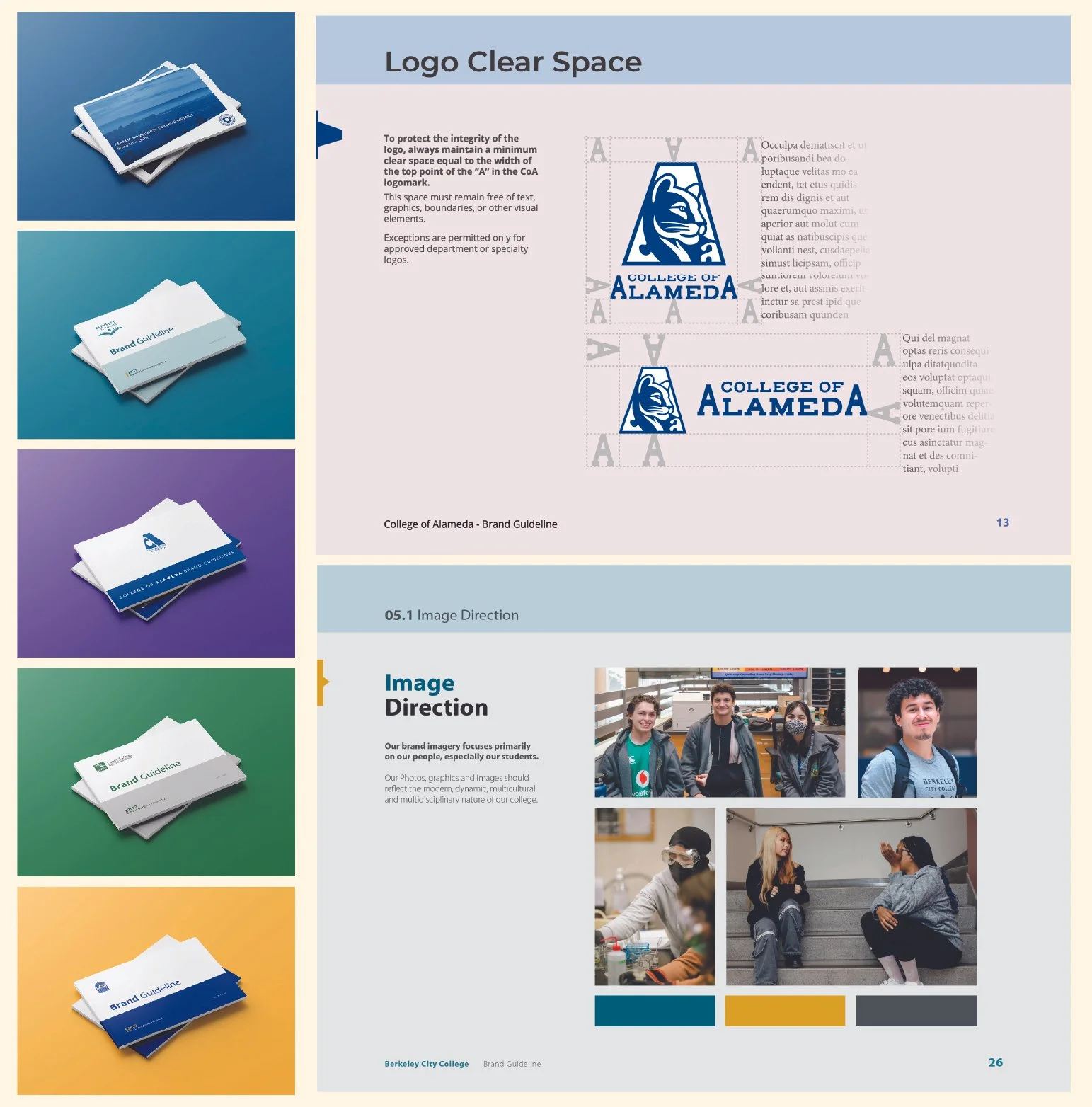
Brand Guidelines
A brand guideline for each campus was developed to establish clear consistent communications. These guidelines defined core visual standards including logo usage, typography, color application, and layout principles, while remaining flexible enough to accommodate varied institutional needs.
Rather than prescribing rigid templates, the guidelines functioned as a shared framework. They provided direction and guardrails while allowing individual colleges to express their identities within an agreed-upon system. This approach supported long-term adoption and reduced friction across departments. Not to mention in empowered the colleges, while freeing up my bandwidth to tackle other duties.
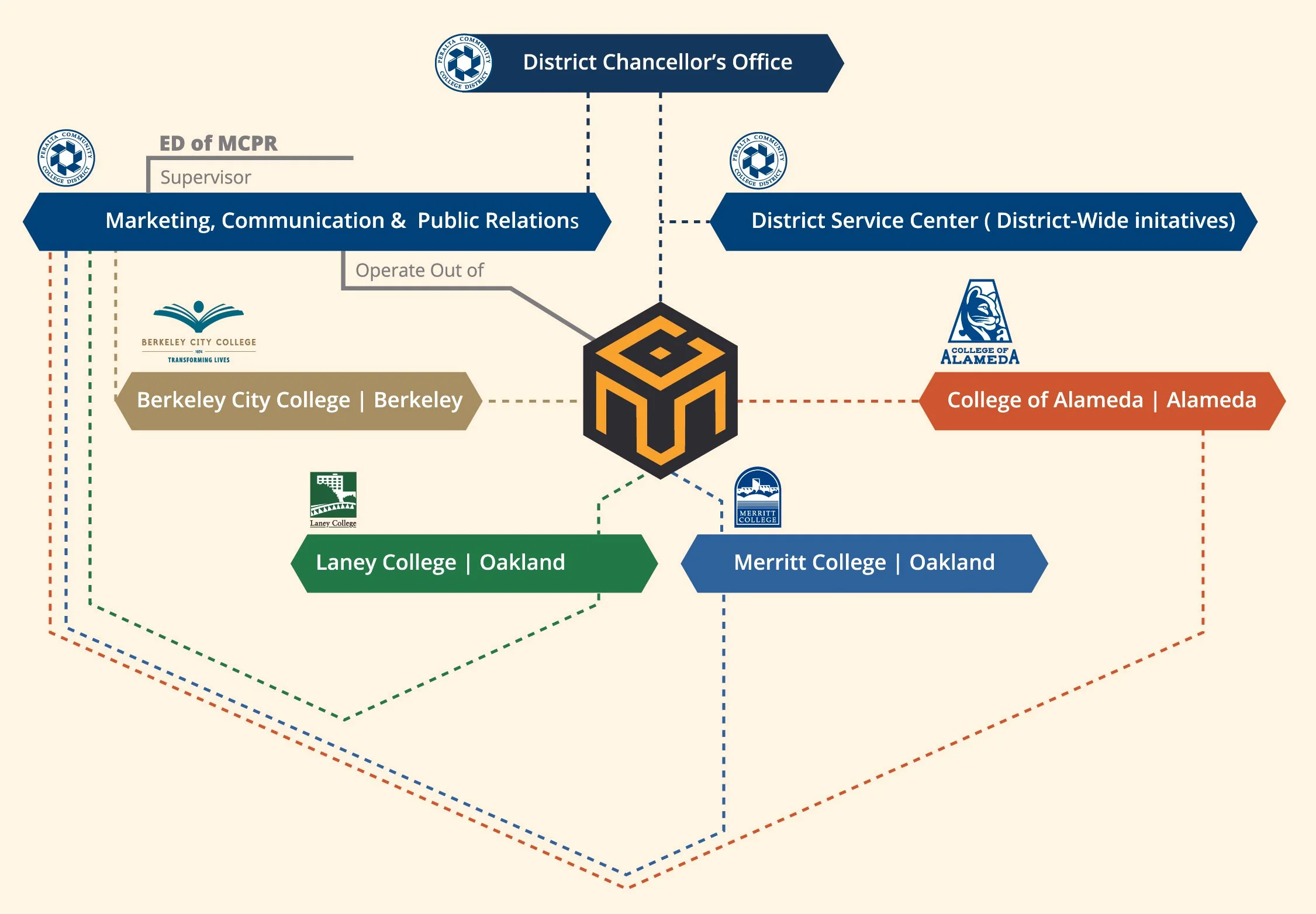
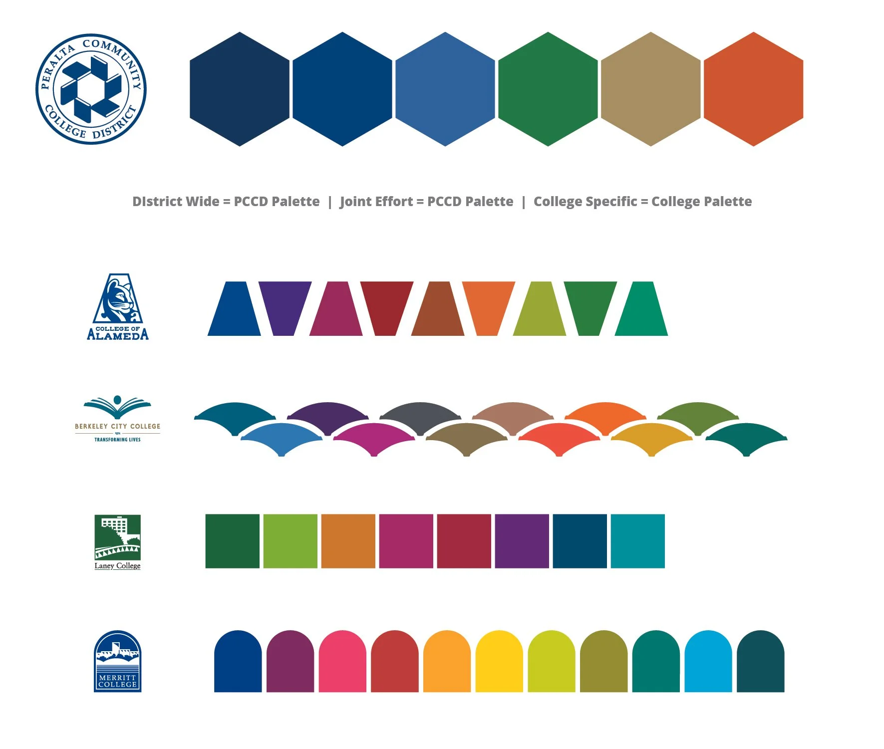
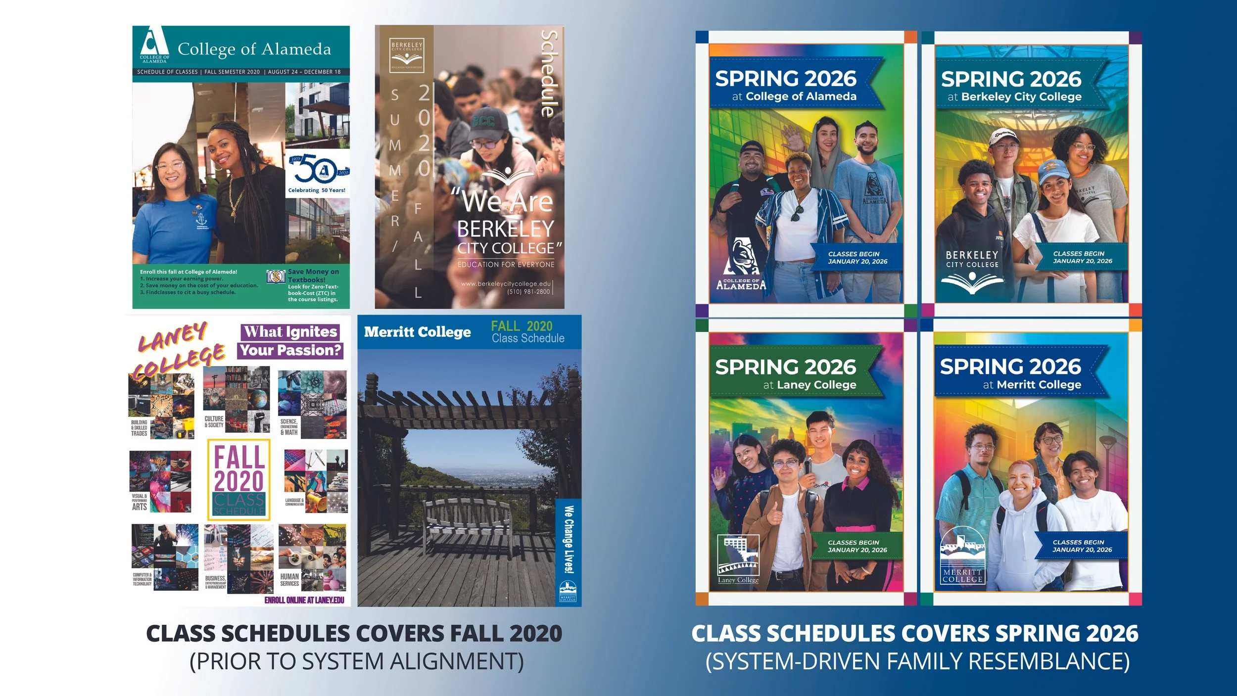
Federated Color Logic
The district brand operates within a federated model. Each college maintains its own primary color palette and visual identity, while the district brand serves as a connective layer rather than a replacement. This parent–child relationship allowed materials to read as part of the same system while still signaling campus identity at a glance.
District communications intentionally use adjacent or secondary colors drawn from campus palettes to reinforce cohesion without duplicating or competing with college identities. This strategy allows the district to visually reference its colleges while preserving institutional distinction, particularly in multi-campus or system-wide materials.
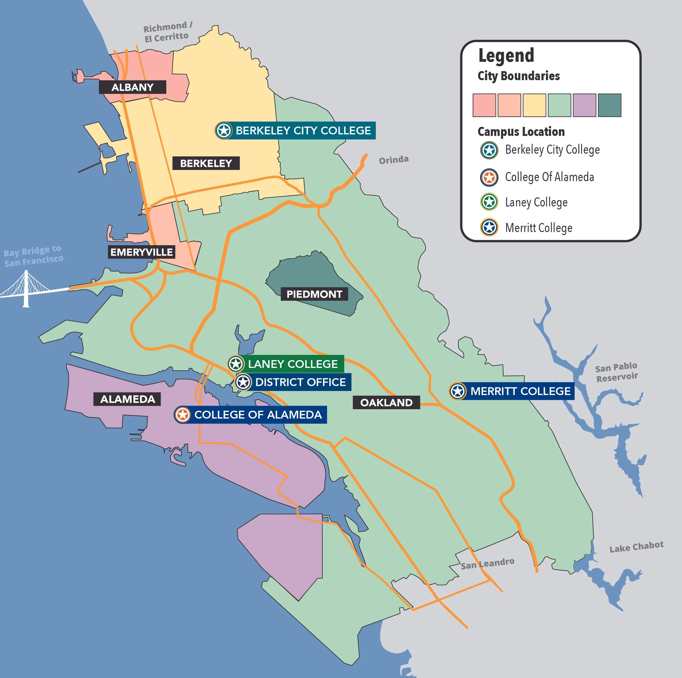
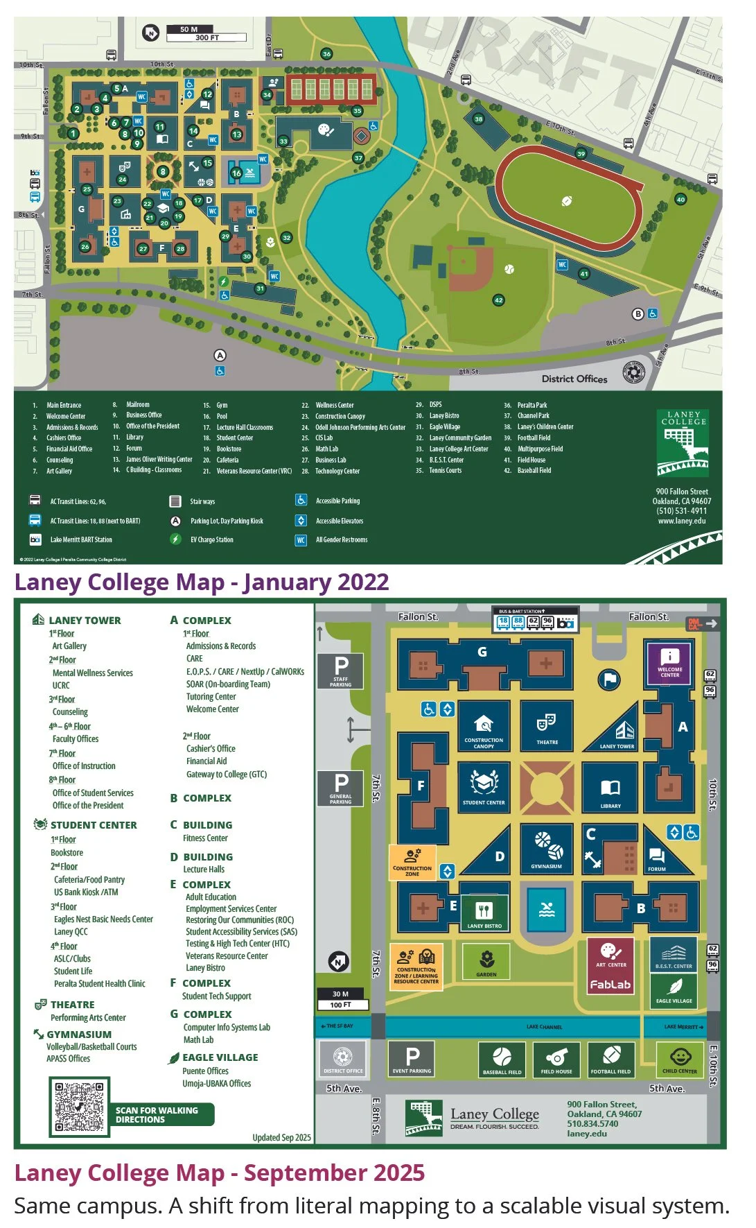
Campus & District Maps
The creation of new maps for each college and the District Service Center improved wayfinding, accessibility, and visual consistency. While each map reflects the physical and spatial realities of its respective campus, all maps share a common design language.
This consistency allows students, staff, and visitors to move between campuses with familiarity while still recognizing each location as distinct. The maps also serve as durable, functional assets used across print, digital, and environmental applications.
The result was a map that reduced cognitive load, clarified navigation, and aligned visually with the broader district system.
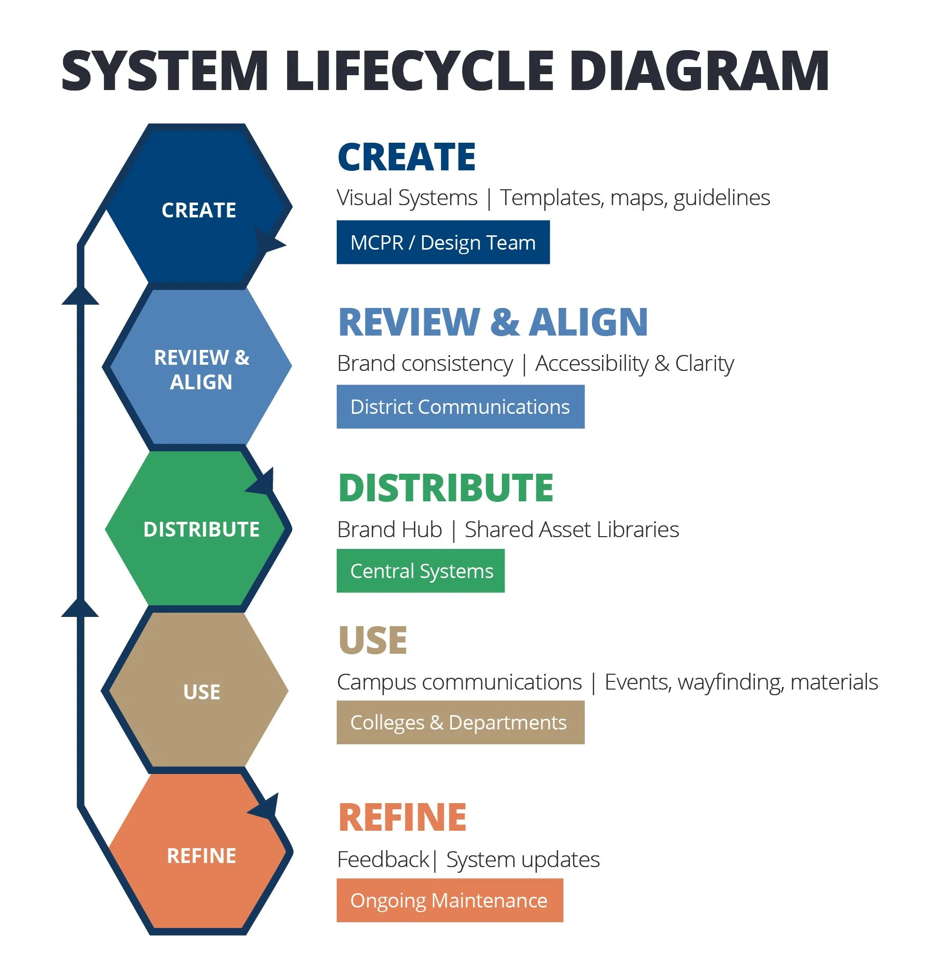
Governance & Adoption
For the system to work long term, it needed to be structured but not centralized to the point of dependency. Alongside creating official district assets, and guidelines, the system was designed to function as a shared foundation that campuses could build on independently.
The district design team establishes the core structure: visual rules, layout logic, color behavior, and baseline assets. From there, campuses are free to produce materials internally or work with external vendors when additional capacity is needed. As long as those materials align with the established system, they remain visually consistent with the district as a whole.
This approach treats design as a service rather than a bottleneck. It allows the system to scale beyond a single designer or team while maintaining coherence, clarity, and long-term durability.
Outcomes & Impact
The clearest outcome wasn’t a single deliverable. It was continuity.
The district brand system has been adopted, providing a shared visual foundation for communications while allowing campuses to maintain distinct identities. Brand guidelines and mapping systems are now used as reference points for new materials, reducing inconsistency and improving clarity across departments.
The federated model has enabled district-wide initiatives to communicate more cohesively without overriding campus-level branding. This balance has increased trust in the system and reduced resistance to adoption, particularly in multi-campus and executive-facing communications.
Campus and district maps continue to be used as durable wayfinding and communications tools across print and digital formats, supporting accessibility and consistency over time. The centralized standards and governance approach have also reduced redundancy, allowing teams to work more efficiently within a shared framework.
Most importantly, the system was designed to be sustainable. By prioritizing clarity, flexibility, and stewardship, the work continues to support evolving institutional needs without requiring constant reinvention.
What this Demonstrates
This work demonstrates systems thinking at institutional scale, the ability to design within federated environments, and the discipline to build tools that last beyond individual campaigns. It reflects a design practice focused on clarity, governance, and long-term use rather than novelty.
My time at Peralta highlights the importance of stewardship, collaboration, and clarity when design decisions intersect with institutional culture and leadership priorities.
Above all, this work shows how design can function as infrastructure: supporting trust, usability, and cohesion across diverse stakeholders and evolving needs of a public education system.