College of Alameda Logo Overhaul
College & Community identity redesign
Overview
This project focused on redesigning the College of Alameda logo as part of a broader effort to modernize the college’s visual identity. The College of Alameda logo redesign was initiated during a transitional period, including the arrival of a new college president, Melanie Dixon, a new district chancellor, Tammeil Gilkerson, and the construction and completion of new campus facilities, such as the Liberal Arts building and the Transportation Technology Complex. This in tandem with the District office sequentially upgrading every website, with college of alameda being the last in the system to transition from wordpress to a platform called hubspot.
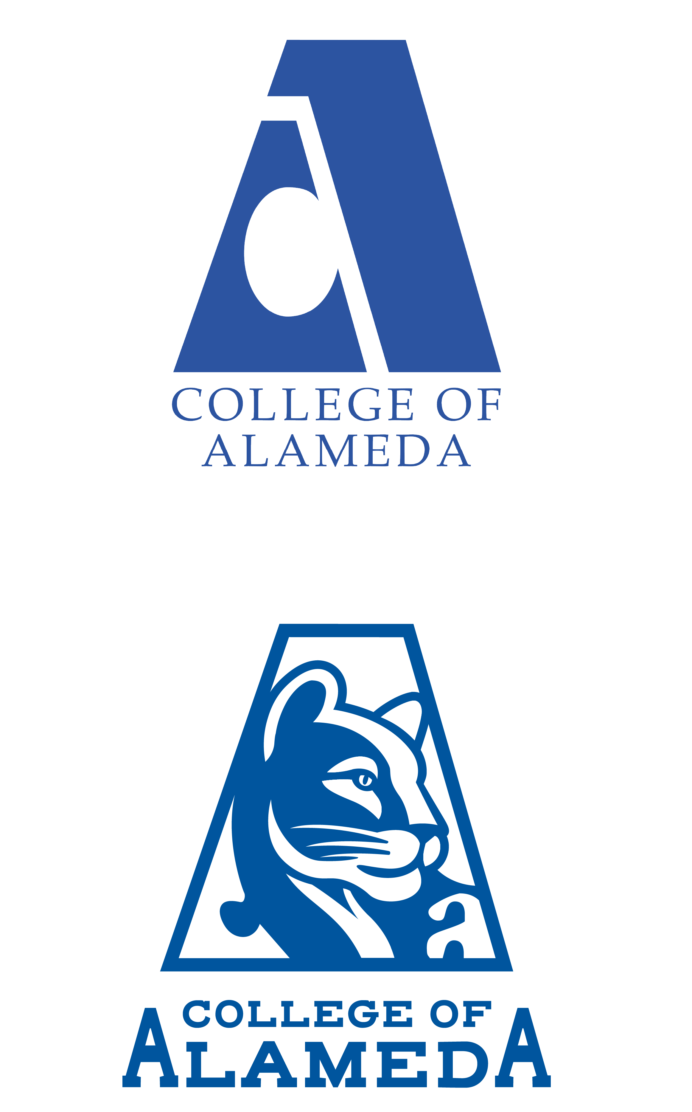
The existing logo had remained largely unchanged for well over 30 years and presented challenges related to scalability, legibility, and relevance within modern digital and environmental contexts. The redesign needed to work just as well on a building sign as it did on a social post, a presentation slide, or a student flyer, while still feeling rooted in the college’s character and environment.
Role & Leadership
I led the logo redesign from concept through final execution. After proposing the redesign directly to President Dixon, I was granted approval to develop the full project plan, including research, stakeholder engagement, survey design, concept development, and executive presentation.
The process culminated in a formal pitch to the Chancellor’s Cabinet, supported by campus-wide survey data with qualitative feedback. Trust was placed in me to manage the research and synthesis independently, ensuring clarity and neutrality throughout the decision-making process.
This was not an isolated exercise. It required listening to the COA community, knowing when to push and when to adjust, and finding a modern solution that reflects the community.
Context & Challenge
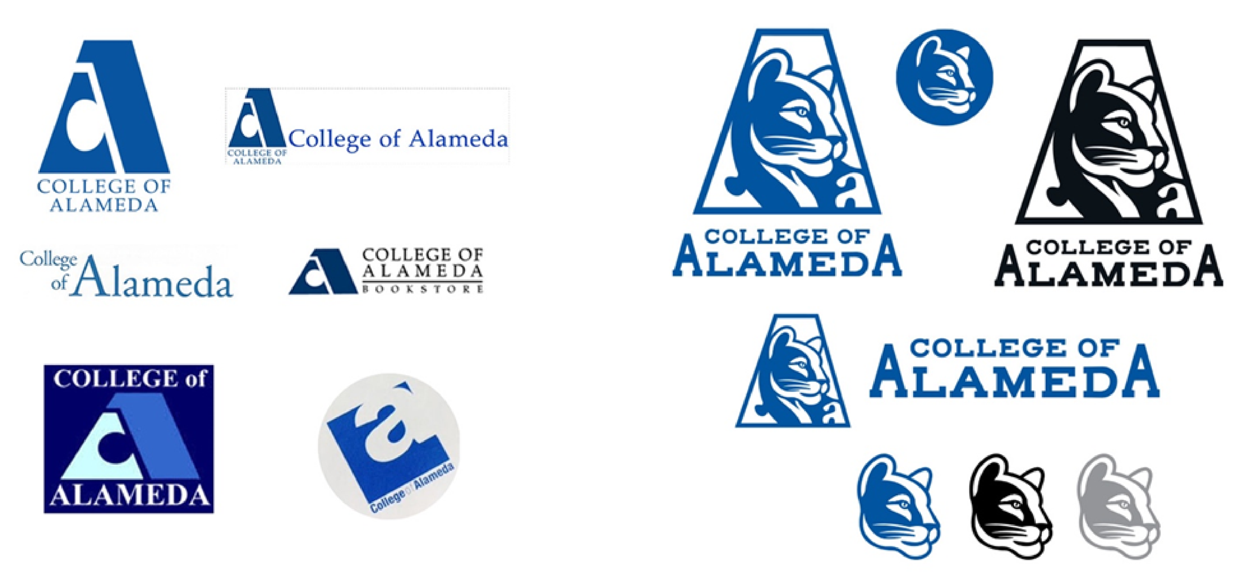
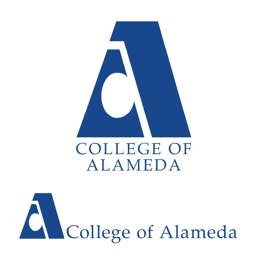
The legacy logo was built around an abstract geometric construction, using positive and negative space to embed the letters “C” and “O” within an “A” form. While the idea was conceptually clever, the execution had become visually rigid and hieroglyphic in tone. Over time, the mark proved difficult to adapt across contemporary platforms, and when paired with the delicate Palatino serif, the typography was consistently overpowered by the weight of the symbol itself.
Beyond aesthetics, the logo presented several practical challenges:
Poor scalability for digital and mobile use
Limited emotional connection to campus culture or student life
Inconsistent application across signage, athletics, and printed materials
A new college website that exposed the logo’s limitations in modern UI environments
Early feedback made it clear that the goal wasn’t to erase the legacy of the mark, but to reinterpret it in a way that felt natural, legible, and reflective of today’s College of Alameda. There was also an understandable sensitivity around change. The college has a strong sense of place and history, and any redesign needed to respect that foundation rather than overwrite it.
The community of Alameda holds it’s college in high esteem, despite its neighbor, Laney College, sitting on the other side of the water about a radial mile away. The challenge ultimately came down to balance: honoring what people recognized while still allowing the identity to move forward.
Design Approach
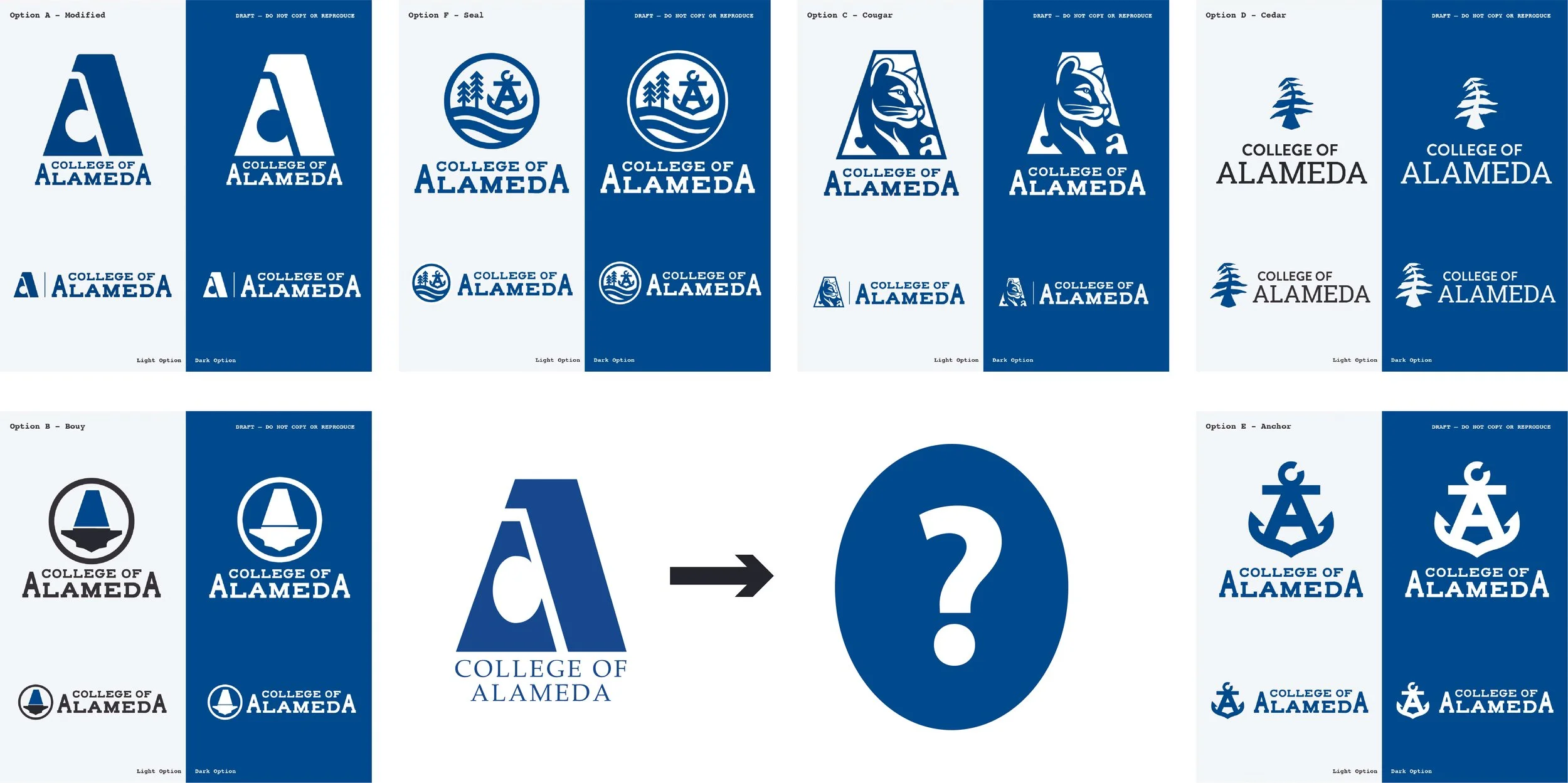
The focus was never on chasing trends or creating something that only worked in a presentation. From the beginning, the priority was structure, longevity, and real-world use. The logo needed to scale cleanly, hold up across formats, and feel natural everywhere the college shows up.
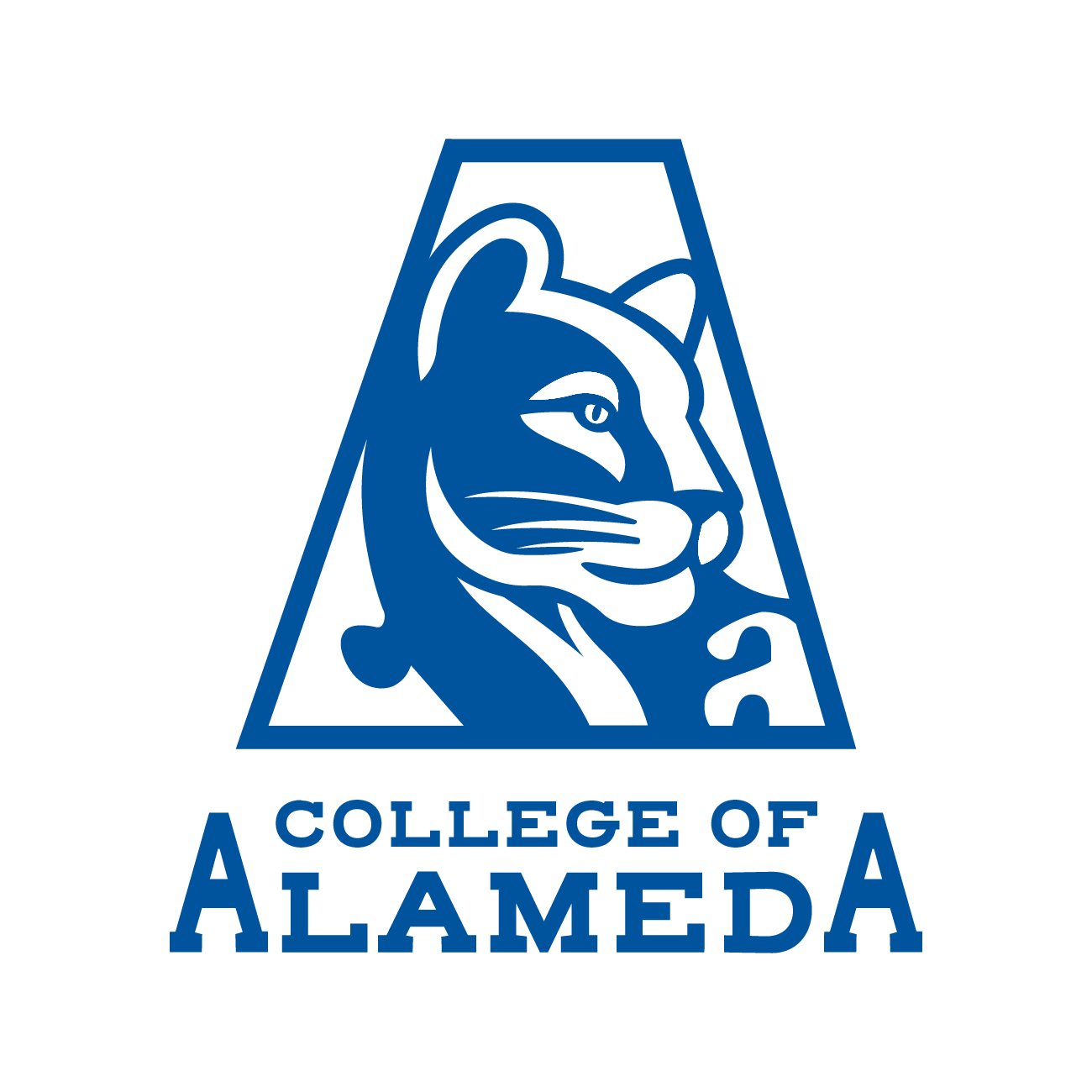
The geometric foundation of the original “A” was kept as a starting point, but its proportions and balance were refined to improve readability and reduce rigidity. Rather than leaning fully into abstraction, the updated mark was shaped to feel warmer and more expressive, reinforcing school pride and identity.
One of the more meaningful shifts was the intentional integration of the college’s mascot, the Cougar, into the broader identity system. While the campus doesn’t have a single landmark or geographic symbol that clearly represents Alameda Island, the Cougar already existed as a shared point of pride, from the Cougar’s Den ( the college’s cafeteria/student lounge) to athletics culture (mens basketball, and Women’s Volleyball). Building on that connection gave the identity a more human presence and strengthened its ties to student life.
There was some initial hesitation reflected in early survey feedback, particularly around the idea of an animal appearing in an official college logo. During the design discussions, examples from other colleges and universities that successfully use mascots as part of their primary identity helped reframe that concern. Over time, the community began to connect with the logo rather than question it, and the Cougar became a welcomed part of the visual language.
Color was an area where the direction was clear early on. Survey feedback showed strong support for retaining the existing palette. Keeping those colors helped the redesign feel familiar while still allowing for major improvements in clarity, consistency, and visibility. In practice, many of the secondary colors had been underutilized or overlooked in previous years. Bringing them forward and showing how they could work in tandem with the new logo reinforced their value and expanded how the palette could be used across campus.
Throughout the process, multiple directions were explored, and the logo was tested in real-world scenarios early on. Refinements were guided by how the mark performed in use, not just how it looked in isolation. Decisions were grounded in usability and consistency, with the goal of creating an identity that people could recognize, use, and feel ownership over.
Implementation & Impact
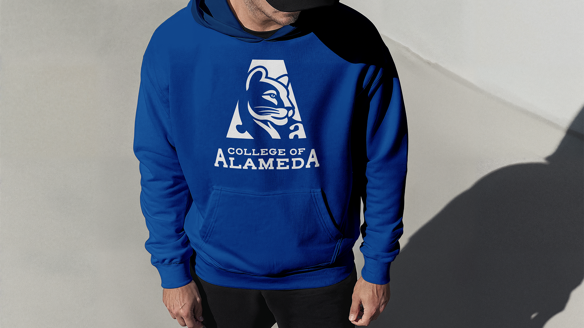
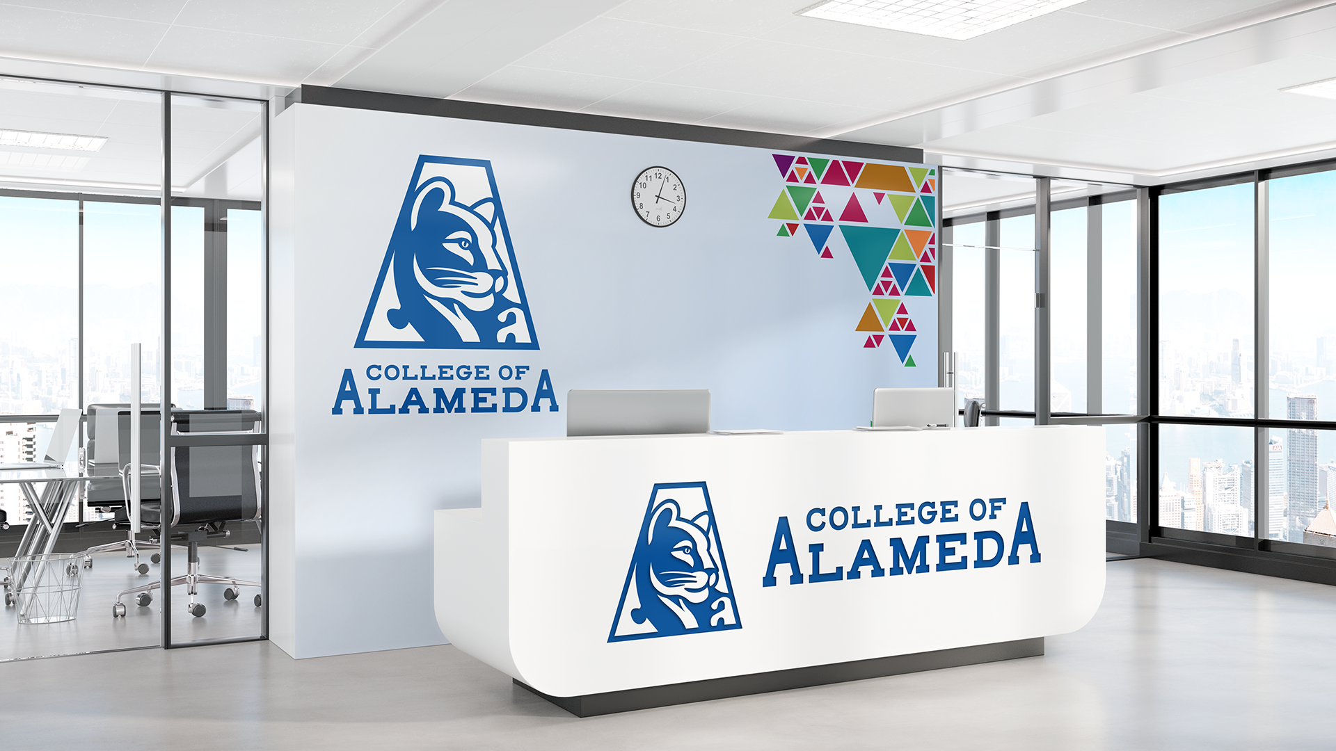
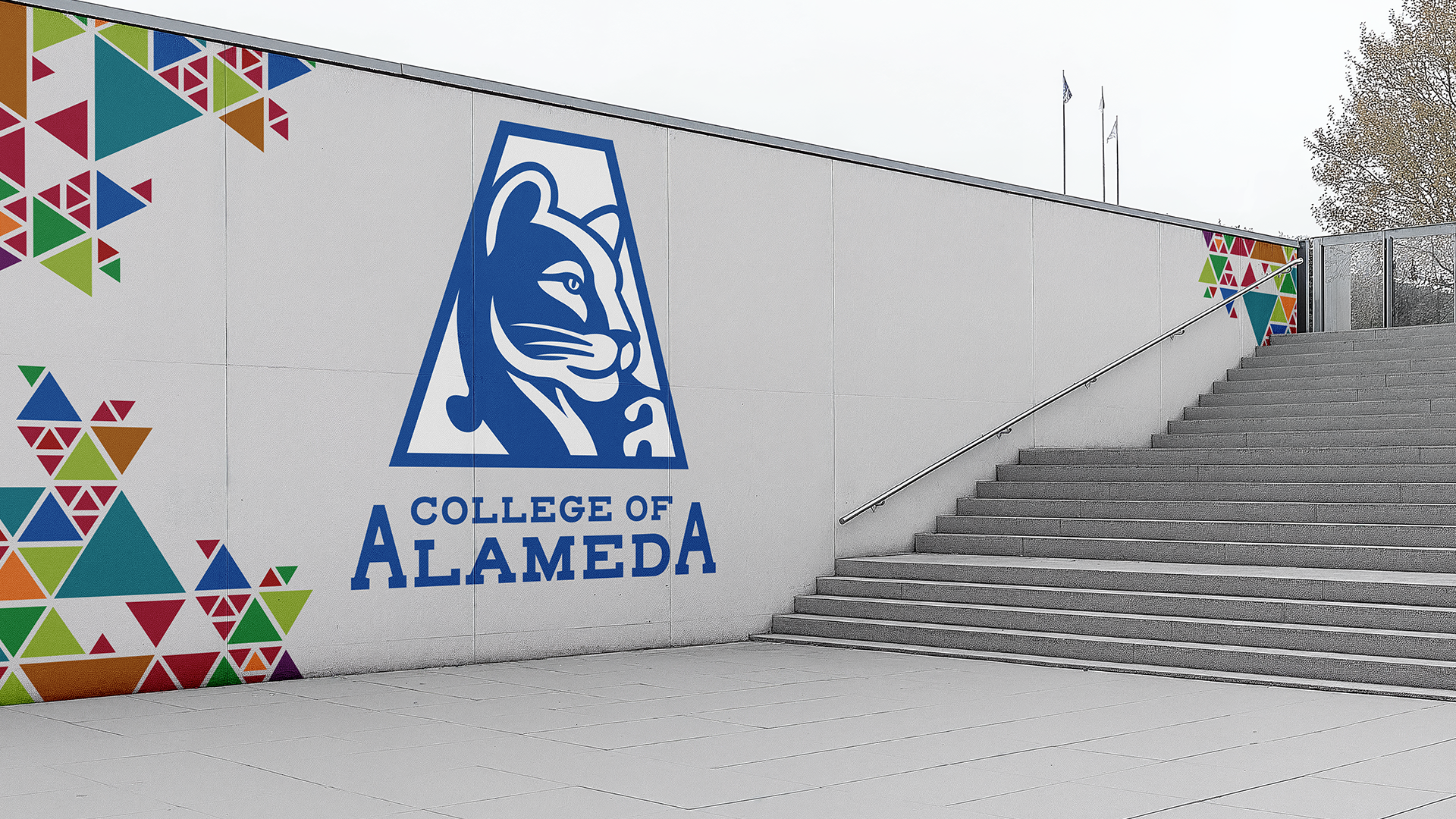
Once finalized, the new logo was integrated into the college’s broader visual system and rolled out across digital, print, and environmental applications.
Applications include:
Exterior signage and potential campus murals
Athletics branding, including the gym floor
College and district electric shuttle vehicles
The redesigned college website and digital platforms
Social media channels
Campus maps and wayfinding materials
Print and internal communications
The identity is now positioned as a unifying visual anchor for the college, instilling school spirit, credibility and student pride. Plus using the logo in several applications, like social media avatars, exbroidery, letterheads - it made it all possible, and far more flexible. The result was a mark that felt easier to use, easier to recognize, and more adaptable across departments and audiences.
Timeline
The redesign process unfolded over several phases, including research, concept development, stakeholder review, refinement, and implementation planning. This phased approach allowed space for feedback while keeping the project moving forward without stalling.
Initial concept development: October 2024
Campus-wide survey conducted: Spring Break 2025
Final presentation and approval: May 2025
Outcome
The final logo provided College of Alameda with a stronger, more cohesive visual foundation. It aligns better with current communication needs, support future growth, and fits naturally within the district-wide brand ecosystem.
By grounding decisions in research, stakeholder input, and an understanding of where it fits in the Peralta Community College District, the project delivered a modernized identity that respects the past while supporting the college’s future growth.
Recognition & Coverage
The College of Alameda brand redesign was formally acknowledged by college and district leadership through internal district communications and on the District News Letter called Peralta Gems. The College President highlighted the project as a moment of institutional renewal, and the work was further documented in a district-wide feature outlining the research-driven approach behind the new identity.