
Case Study 3: Athletics Posters & Visual Culture Initiative
A self-initiated visual system elevating athletics across campuses
Context & Opportunity
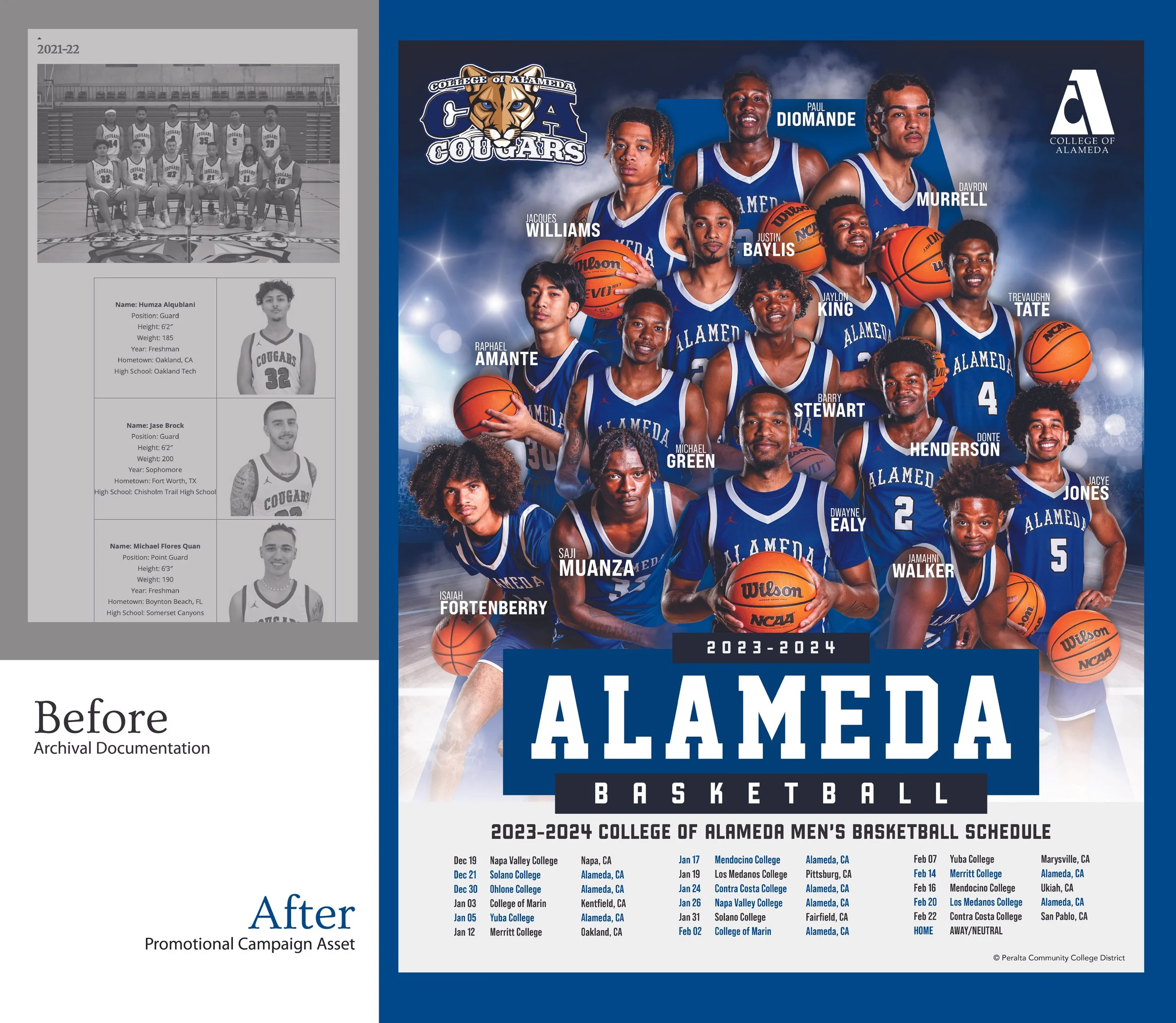
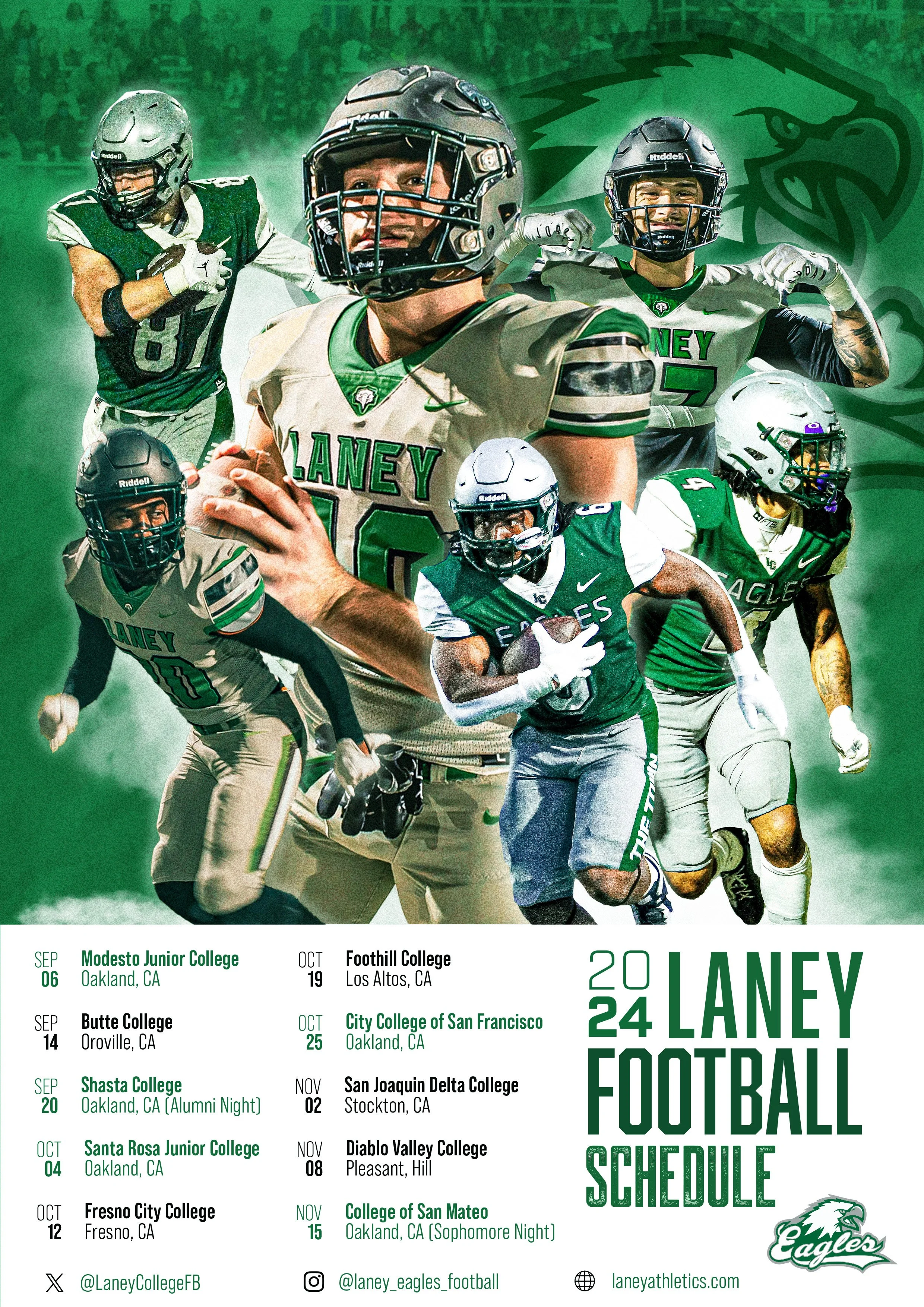
Athletics across the Peralta colleges historically relied on minimal visual storytelling. Photography was often captured for archives or roster use only, with little emphasis on expressive or promotional design. Occasionally, a program with sufficient funding, such as Laney College’s Football Program, would fully embrace the power of media, with their highlight moment being featured on Netflix’s docu-series Last Chance U.
Despite strong athletic programs across multiple campuses, there was no cohesive or contemporary visual language supporting them.
This project began as a self-initiated effort, driven by a desire to elevate how student athletes and teams were visually represented. Rather than waiting for a formal request, the goal was to demonstrate what was possible when athletics were treated as a cultural asset, not just a logistical one.
The Shift
This poster marked a shift from archival documentation to active promotion and became the foundation for future athletics campaigns.
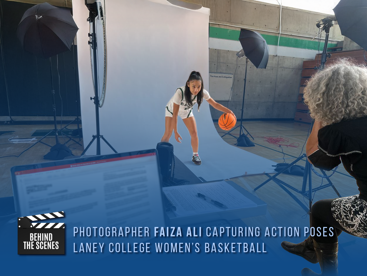
My colleague Faiza Ali and I realized that the amount of work required to run a full media day didn’t make sense if the end result was limited to a set of headshots living quietly on a roster page. The effort was high, but the impact was low.
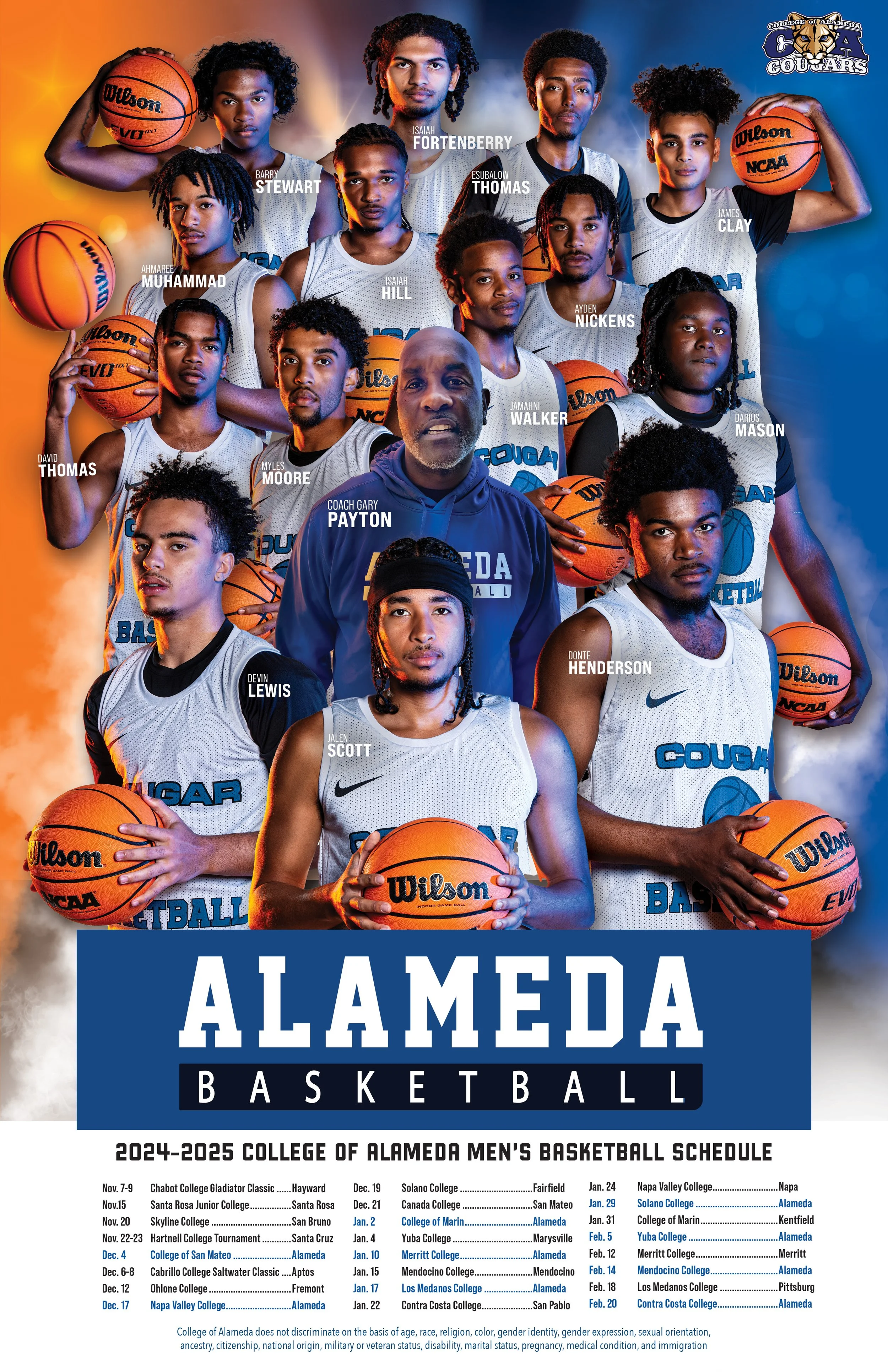
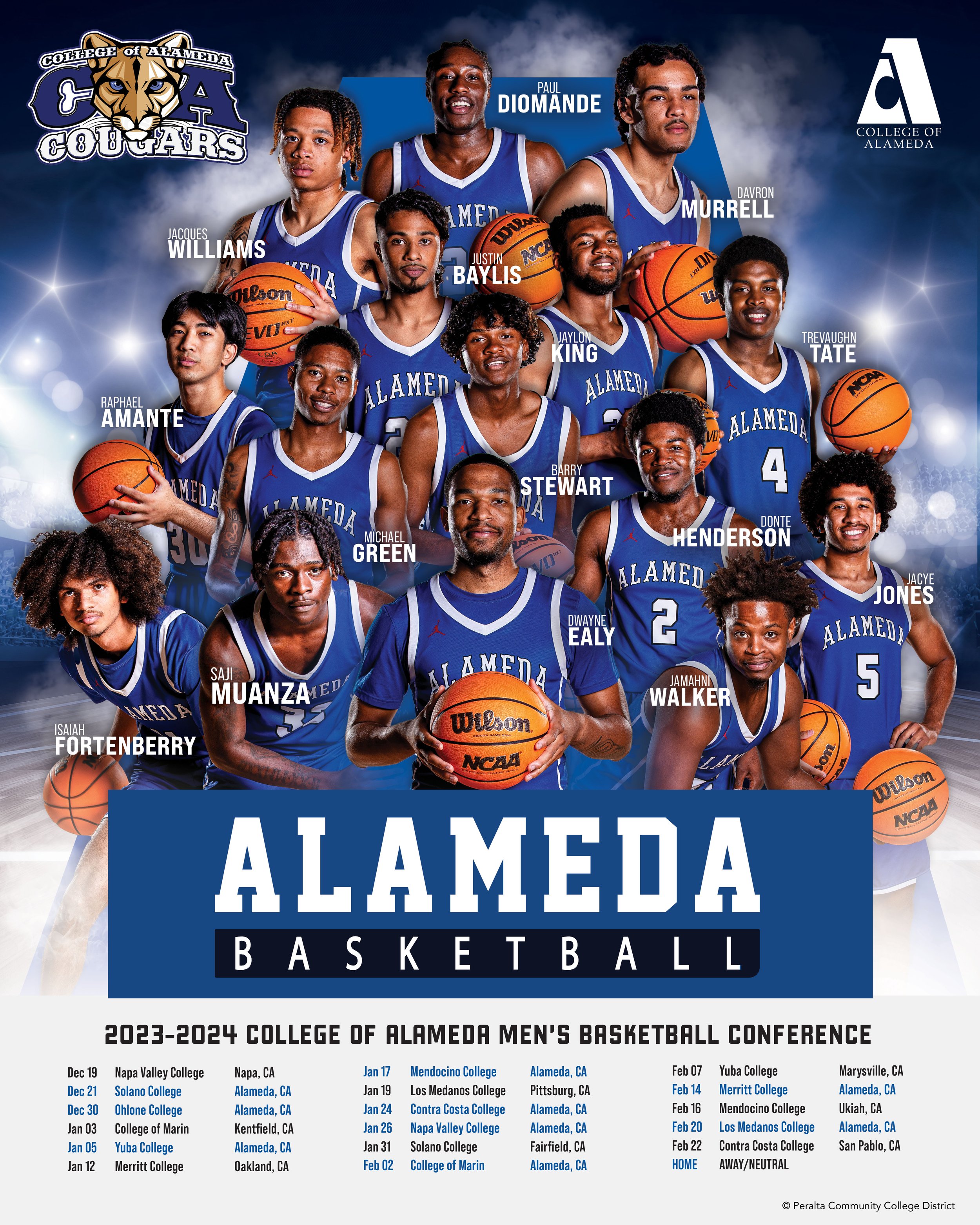
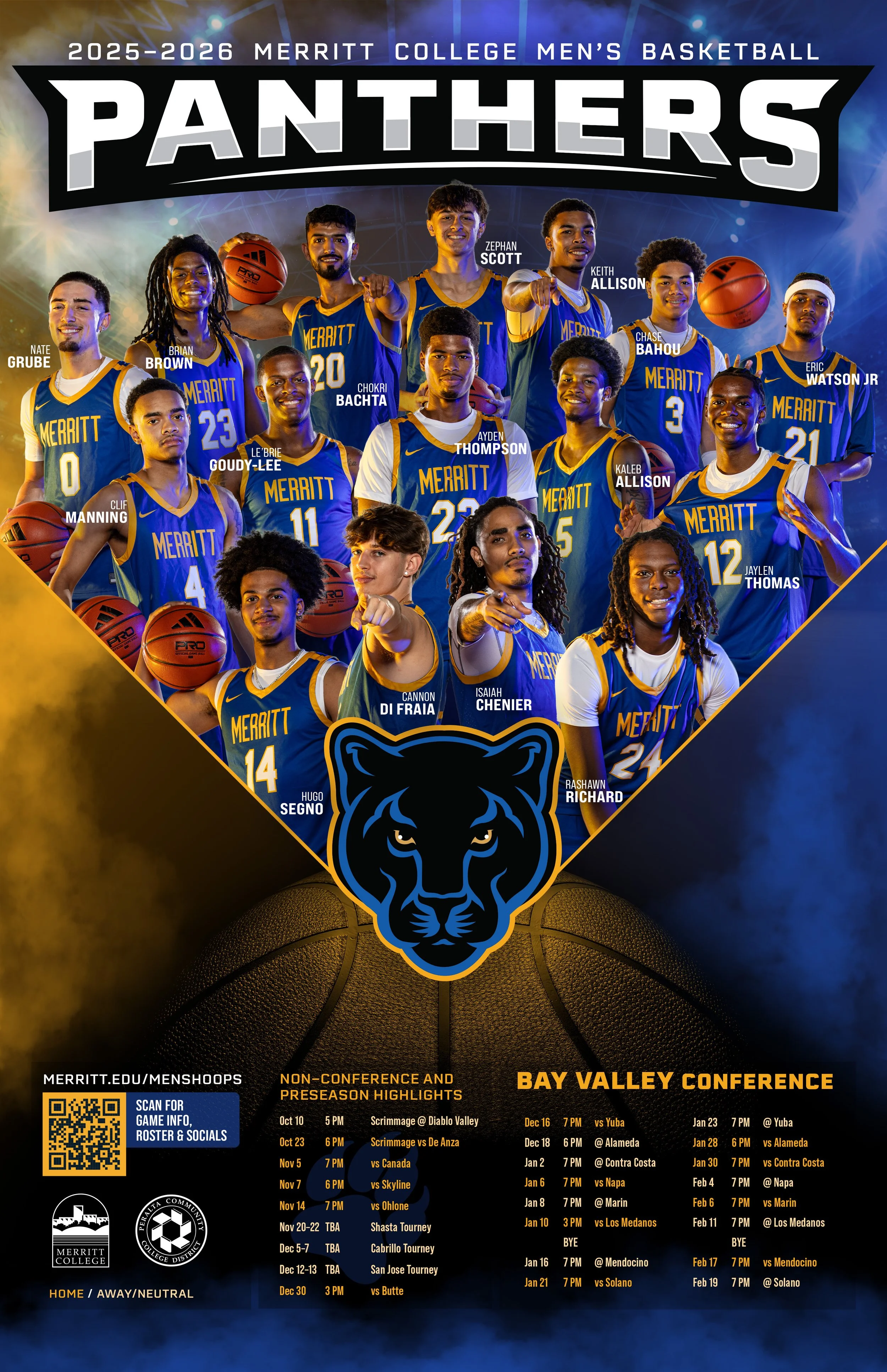
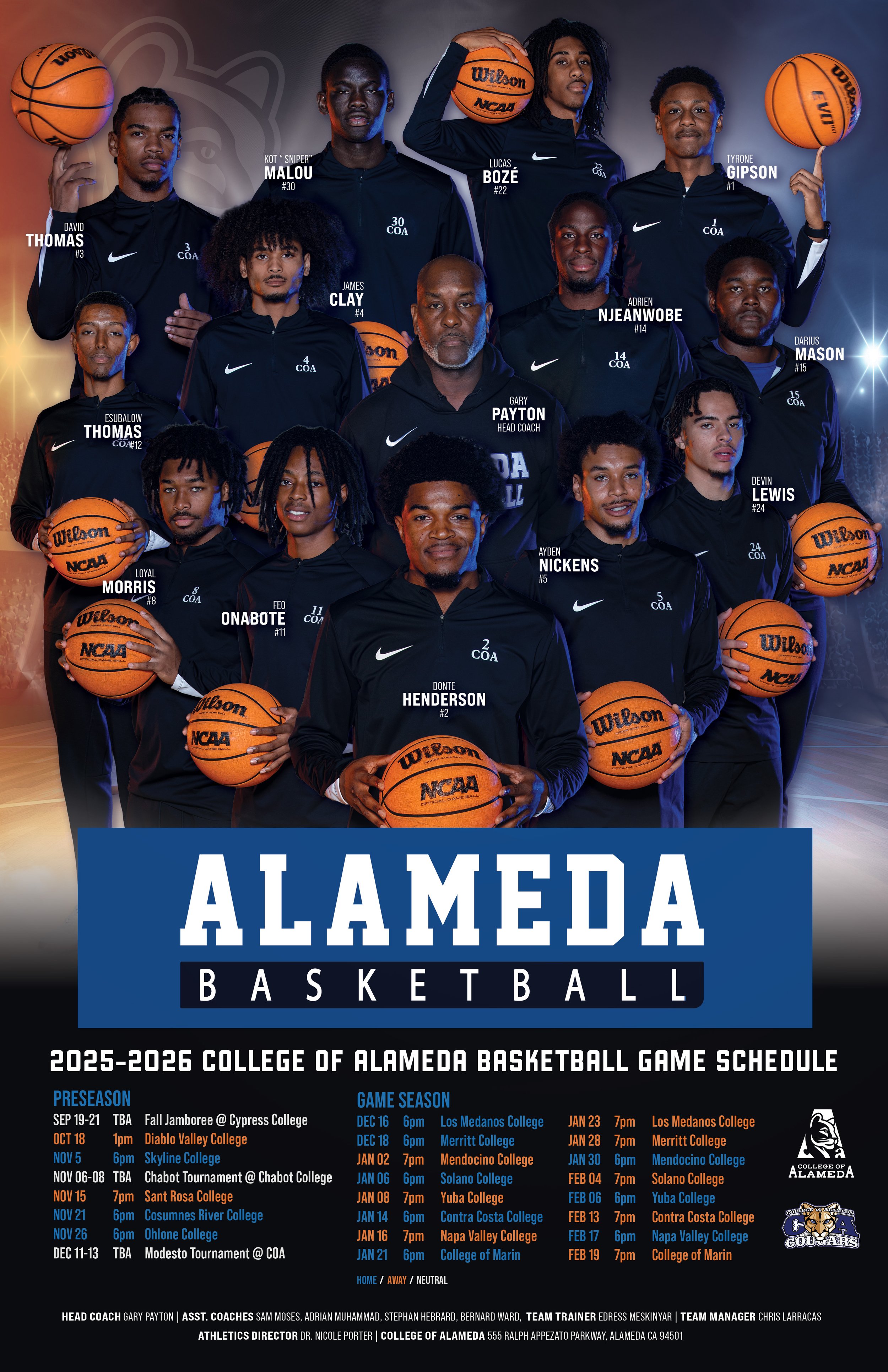
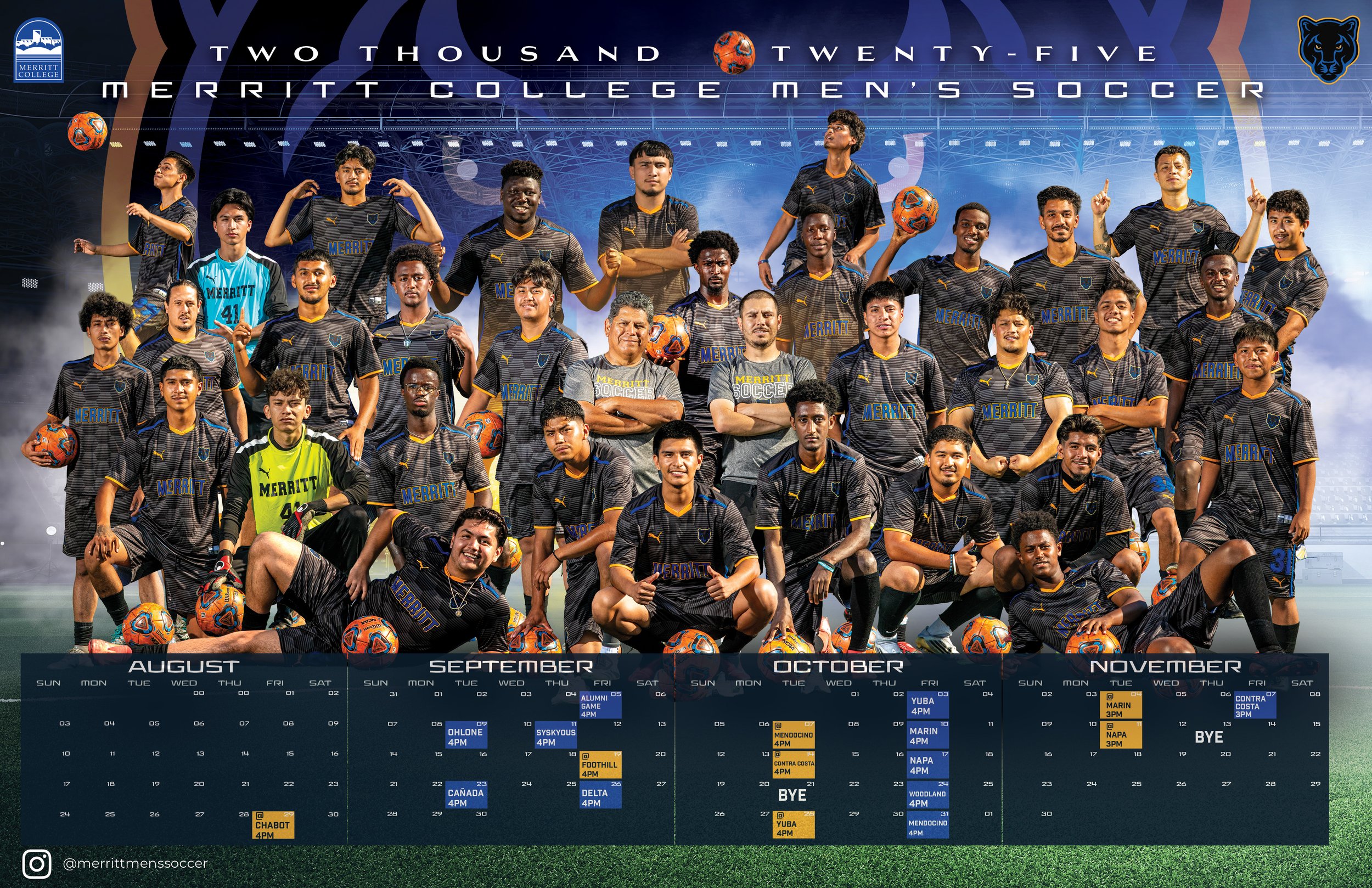
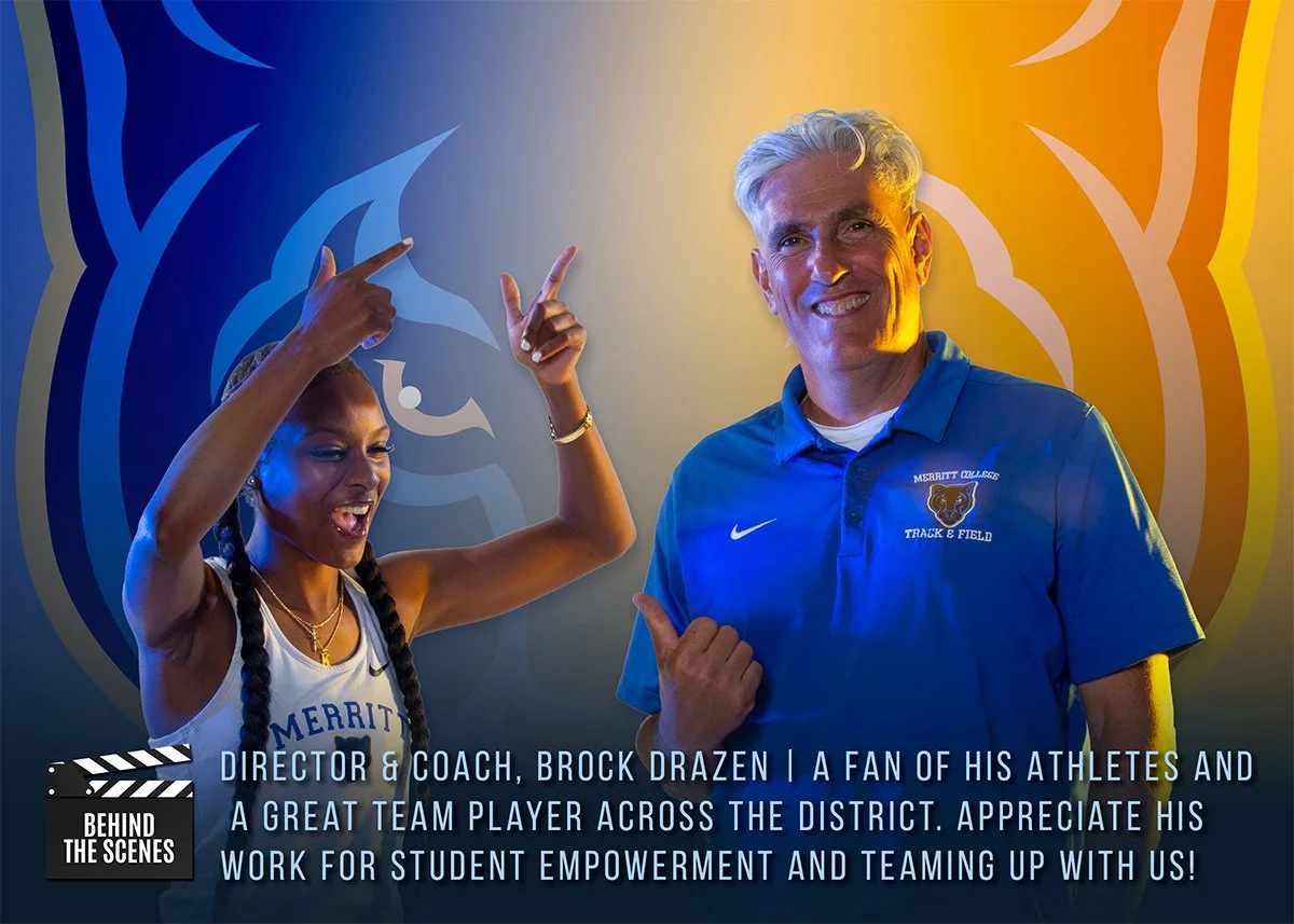
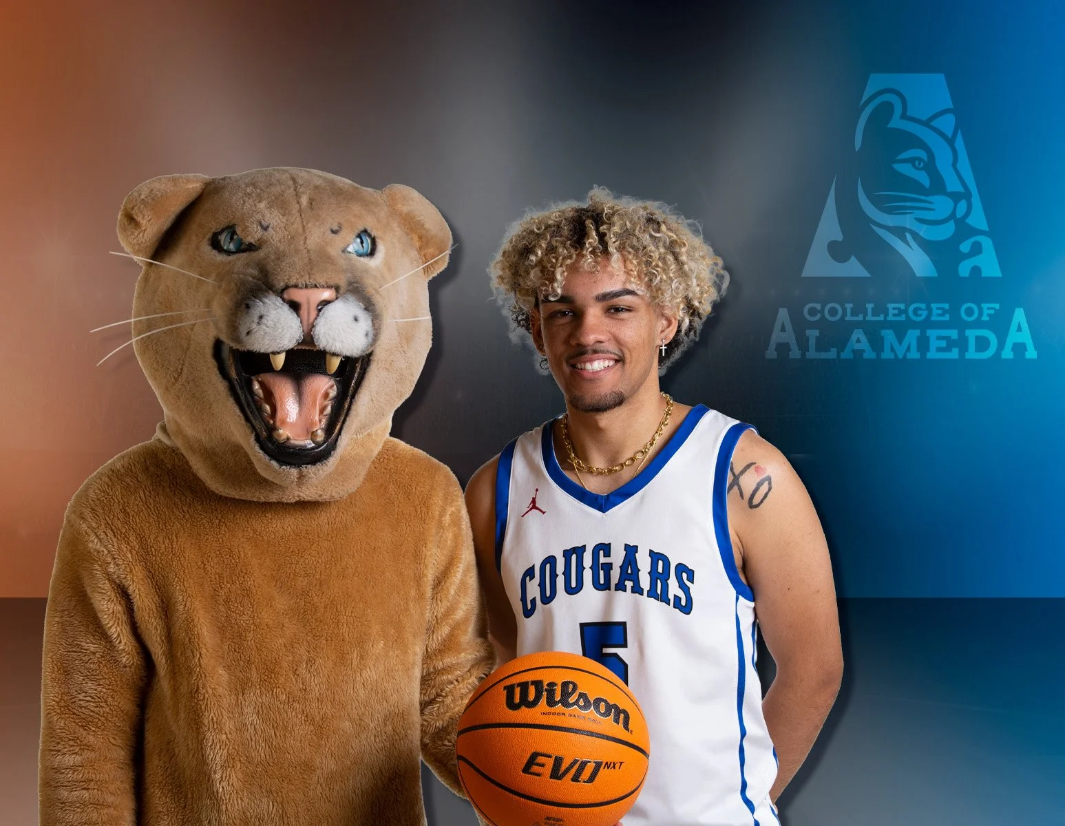
We wanted to create something that centered students, gave them visibility, and treated them like the athletes they are. College of Alameda’s Men’s Basketball team became our first opportunity to try something new within the district: producing a full schedule poster, in-house, with the kind of presence typically seen at the university level.
These students are just as skilled and committed as their peers at larger institutions. This project gave them a platform to shine, boosted team morale, and set a new standard for how athletics could be visually represented moving forward.
Execution
Visual Direction
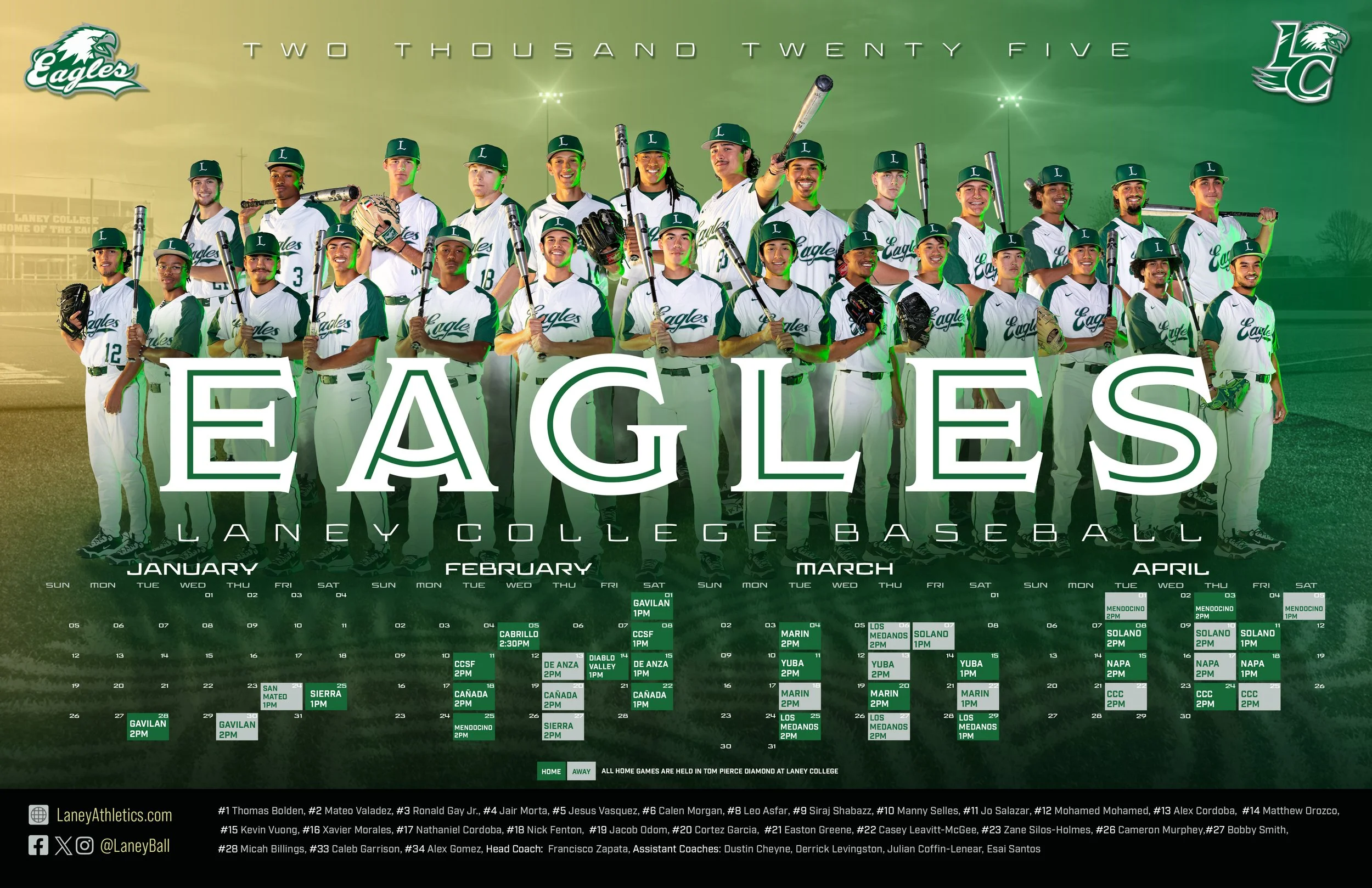
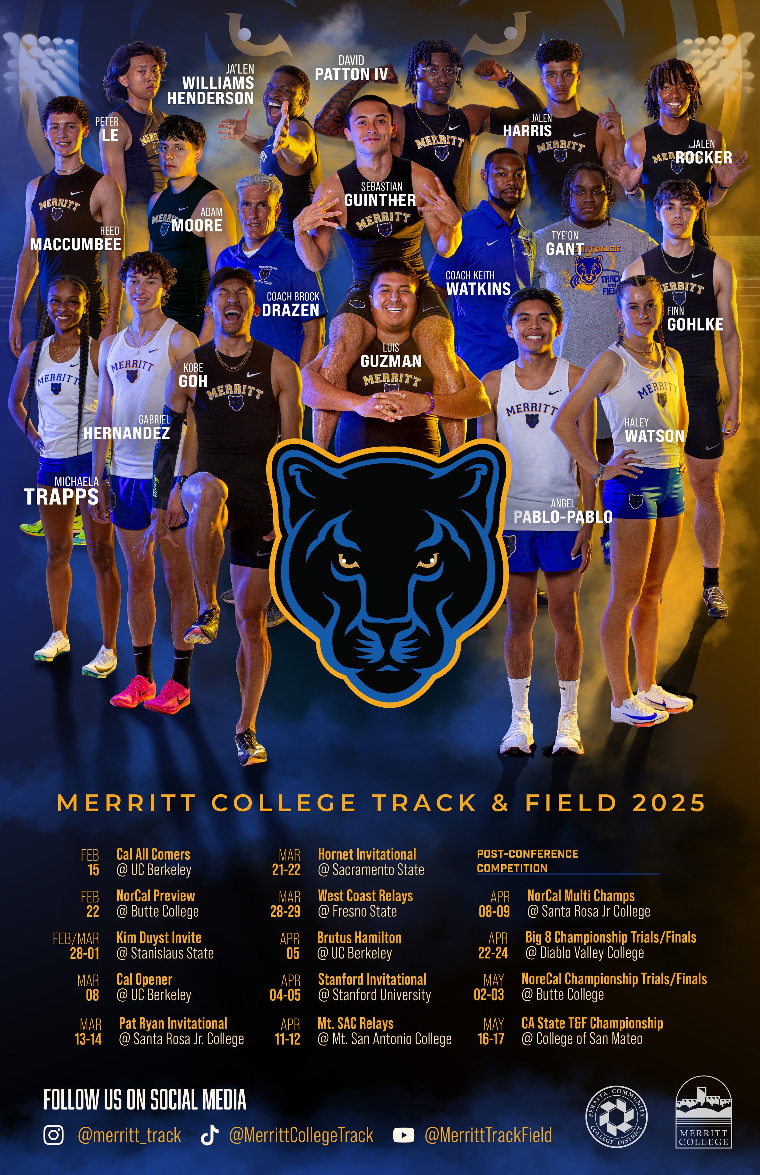
The posters were designed to feel bold, contemporary, and celebratory. Each piece balanced athletic intensity with school identity, creating visuals that felt relevant to students while remaining institutionally appropriate.
Photography, typography, and color were treated as equal components, allowing each campus’s athletic culture to shine without forcing uniformity.
Scope
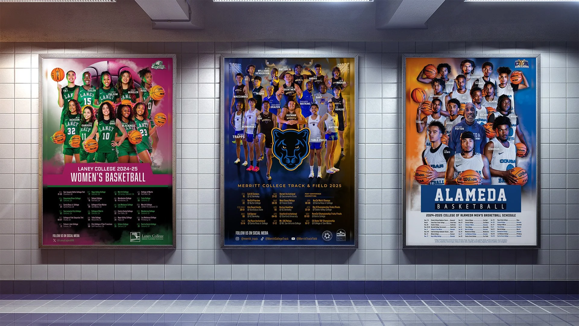
Over time, this initiative expanded to include posters and schedules for teams across multiple campuses, including:
Basketball
Soccer
Baseball
Track & Field
Select one-off teams as needed
Collaboration & Momentum
This work was developed in close collaboration with my colleague Faiza Ali and the respected Athletics directors at each college, driven by a shared interest in pushing creative boundaries within a highly siloed environment.
Although athletics marketing was not originally part of our formal workload, the success and reception of the posters demonstrated a clear appetite for stronger visual storytelling across campuses.
As a result, these posters became a recurring and anticipated part of the athletics season, rather than one-off experiments.
Visual System & Execution
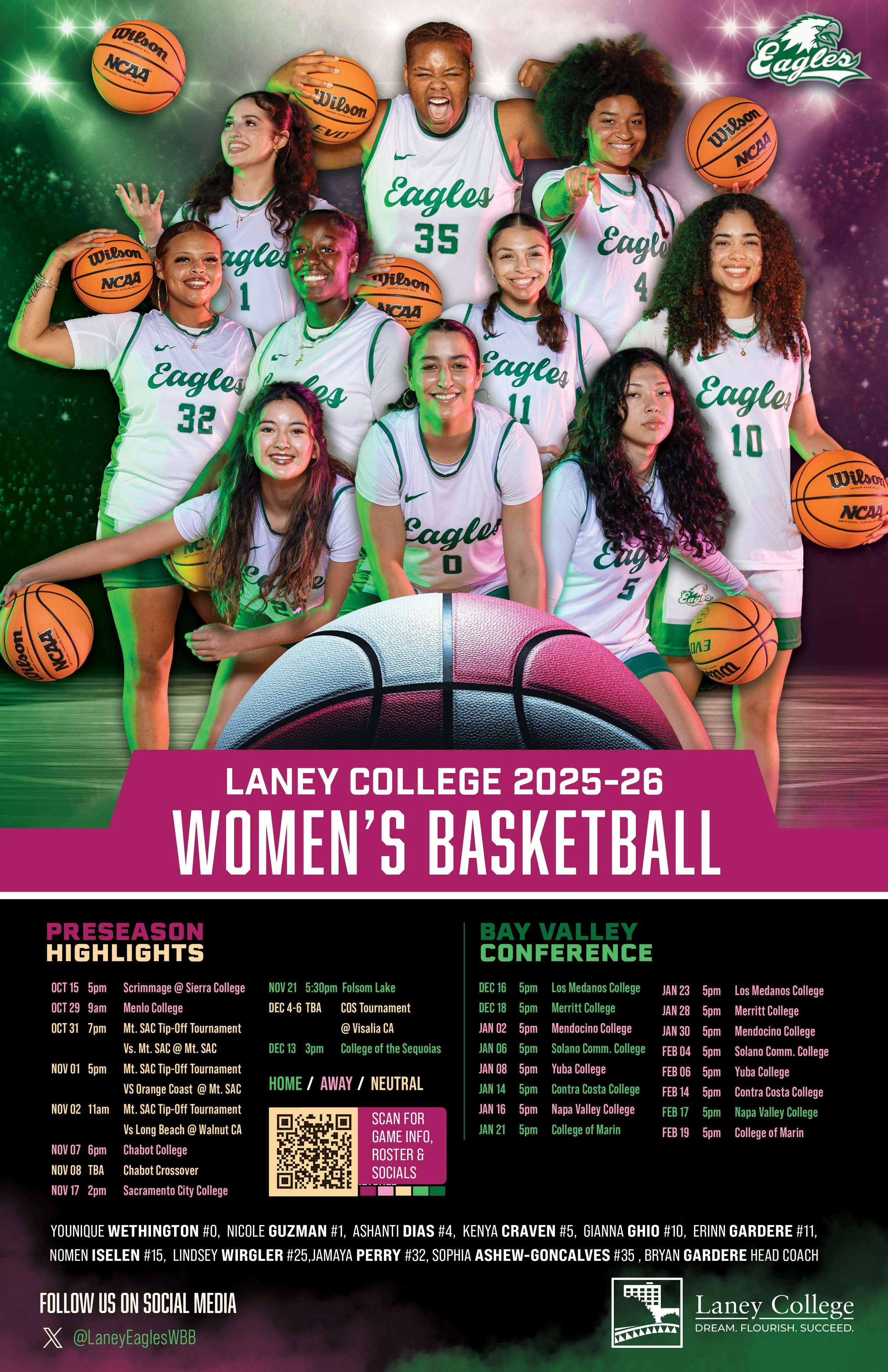
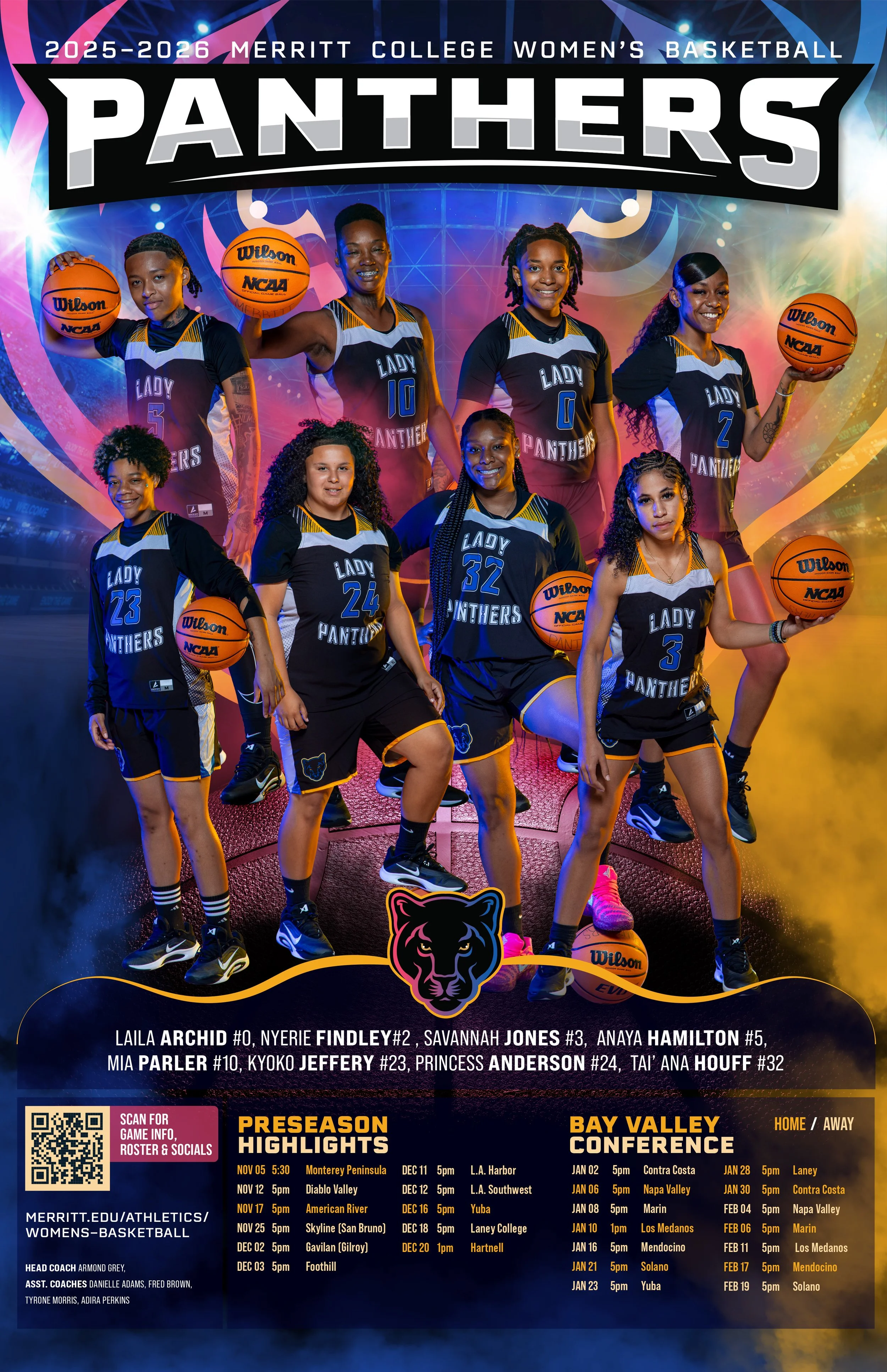
Execution focused on building a flexible visual system that could scale across teams, campuses, and seasons. Photography, compositing, and typographic hierarchy were treated as foundational elements, ensuring clarity and consistency across all outputs. A campus-specific duotone photo treatment reinforced identity at scale: orange and blue for College of Alameda, blue and golden yellow for Merritt College, and green and gold for Laney College. Select women’s teams incorporated pink accents, drawing from existing brand palettes to highlight gender equity while remaining institutionally aligned. Campus branding was integrated thoughtfully, allowing each program’s identity to remain intact while participating in a shared visual language. This system-first approach enabled repeatable production and long-term use without visual fatigue.

Outcomes & Recognition
Posters adopted across multiple campuses
Increased visibility and pride around athletics programs
Work shared internally across departments beyond athletics
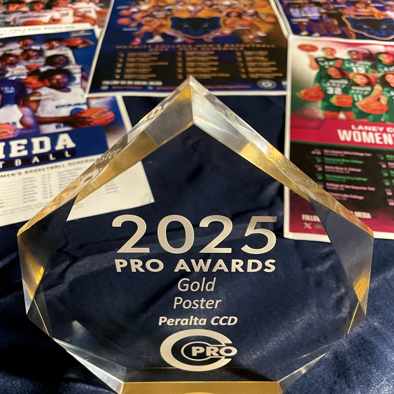
The poster series received CCPRO recognition (Silver or Gold) for design excellence
The initiative has since become a visual staple within the department
What this Demonstrates
This project demonstrates initiative beyond assigned scope, a growing command of visual systems, and the ability to elevate overlooked areas of institutional life through design. Much of this work represents new territory for me, particularly in sports photography and athletics-driven visual storytelling. Rather than relying on prior specialization, I approached the work with intentional study, experimentation, and iteration, benchmarking against university-level and professional sports design standards.
The result is a cohesive, repeatable system that performs at a level typically associated with larger programs and dedicated athletics departments, achieved within the constraints of a public-sector environment. It reflects a balance of creative instinct, collaboration, and execution, while marking a clear expansion of my skill set and confidence as a visual communicator.